(no subject)
Ok folks, some people ask me for a tutorial and I have a really easy one to make your (most with pictures than photos) icons look bright and nice.
With no selective colouring, ( SC is pretty useful but a pain in the ass too)
That’s my first tutorial, sorry for the mistakes and if something isn’t well explained at all.
Here we go, how to go from:
this: to this:
In 6 easy steps! =D
With no selective colouring, ( SC is pretty useful but a pain in the ass too)
That’s my first tutorial, sorry for the mistakes and if something isn’t well explained at all.
Here we go, how to go from:
this:
to this: In 6 easy steps! =D
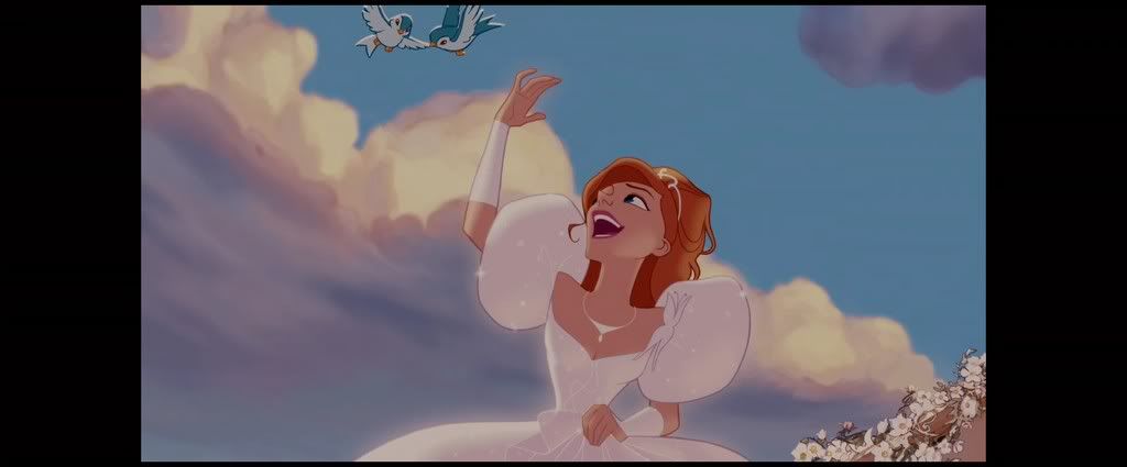
1. Pretty obvious, choose your pic. I used this pic of Giselle form the new Disney movie “Enchanted” and do the basics: Crop, sharpen, and resize it. I usually to the sharp thing in the end, but that’s maybe just me.
2. Now that you have your base you should duplicate it and made it to screen if it’s to dark or to multiplicity if it’s too light. For my base I duplicated the image two times at screen 100% opacity
It should look like this:

3. New layer, fill it with #0B0438 set it to exclusion 53% opacity. Different bases need different opacities, you should play with them. Now it looks like that:

4. Create a new layer, fill it with #6A95ED set it to color burn 43% opacity.

5. Create a new layer, fill it with #EF9DAE set it to soft light 100% opacity.

6. Go to Layers and create a brightness contrast layer with:
-brightness: -16
-contrast: +21
Sharp the image and you’re done!

Now you can add text, textures, whatever you want =D
Other examples of icons done with this colouring:


Oh and for those awesome people who took the time to read my tutorial here’s the PSD
^_^ tell me what you think
2. Now that you have your base you should duplicate it and made it to screen if it’s to dark or to multiplicity if it’s too light. For my base I duplicated the image two times at screen 100% opacity
It should look like this:
3. New layer, fill it with #0B0438 set it to exclusion 53% opacity. Different bases need different opacities, you should play with them. Now it looks like that:
4. Create a new layer, fill it with #6A95ED set it to color burn 43% opacity.
5. Create a new layer, fill it with #EF9DAE set it to soft light 100% opacity.
6. Go to Layers and create a brightness contrast layer with:
-brightness: -16
-contrast: +21
Sharp the image and you’re done!
Now you can add text, textures, whatever you want =D
Other examples of icons done with this colouring:
Oh and for those awesome people who took the time to read my tutorial here’s the PSD
^_^ tell me what you think
no subject
no subject
no subject
no subject
no subject
It was very well-done.
And I'll use this for sure next time I make icons.
I've also downloaded the PSD.
no subject
^_^ you last comment conviced me to made the post so thank to you babe
PS: now I'm doing more Death note icons. Mostly based on doujisnhis XD
mello and matt are a total badass and I love them :3
and for example my avatar
no subject
let me see what you get
no subject
Qué genial.
Muchas gracias por el tutorial, lo voy a probar. :D
no subject
no subject
Muchas gracias por su tutorial. v^_~v
no subject
besos!
no subject
I am just starting with photoshop and found this very useful!
I'll be sure to credit you and this tutorial if I ever learn how to make great icons!
no subject
^__^ <3
Que sencillo tut!!
Adios!!
Re: Que sencillo tut!!
no subject
no subject
^^'
no subject
I can translate the tutorial in Italian? citing your credits XD
no subject
I'm form spain ^___^
no subject
i love spain XD
no subject
no subject
no subject
no subject
no subject